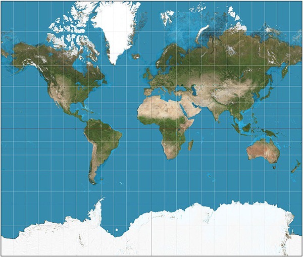
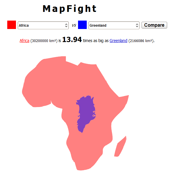
Did you know Greenland is approximately 14 times smaller than the great continent of Africa, even though both appears to takes the same amount of area on the map? That’s because maps are intrinsically inaccurate. It is impossible to accurately represent the surface of the earth on a piece of paper because the earth is spherical while a map is flat. Imagine peeling an orange and pressing the orange peel flat on a table - the peel would crack and break as it was flattened because it can't easily transform from a sphere to a plane. The same is true for the surface of the earth and that's why we use map projections.
Map Projection
All map projections distort the surface in some fashion. Depending on the purpose of the map, some distortions are acceptable and others are not; therefore different map projections exist in order to preserve some properties of the sphere-like body at the expense of other properties.
A very famous projection is the Mercator Map.
The Mercator projection was invented by the Flemish geographer and cartographer Gerardus Mercator in 1569. It became the standard map projection for nautical purposes because of its ability to represent lines of constant course. On his map, lines of latitude and longitude intersect at right angles and thus the direction of travel - the rhumb line - is consistent. While the linear scale is equal in all directions around any point, the Mercator projection distorts the size and shape of objects as we move from the Equator to the poles.
On Mercator's map Antarctica appears to be the biggest continent that wraps around the earth and Greenland appears to be just as large as Africa. Alaska appears to take as much area on the map as Brazil, when Brazil's area is actually more than 5 times that of Alaska.
Even though Mercator never intended his map to be used for purposes other than navigation, it became one of the most popular world map projections due to its unique properties. A better attempt to solve the problem of showing the whole globe as a flat image was made by Arthur H. Robinson in 1961. He created the Robinson projection where he discarded existing projection rules to create a map that is visually attractive.
Robinson projection
During the 20th century, the National Geographic Society, various atlases, and classroom wall cartographers adopted the rounded Robinson Projection. Later, the National Geographic Society switched to an improved version – the Winkel tripel projection, which is now followed by many educational institutes and textbooks.
Below are some map comparison tools that allows you to grasp the true size of a country or region by overlaying maps of different regions over each other.
OverlayMaps
OverlayMaps lets the user compare the sizes of different countries, states/provinces, lakes/rivers and other landmarks around the world. There are a few drawbacks of OverlayMaps such as the inability to compare sizes of continents, and custom regions. The collection of rivers and lakes is also rather poor.
MapFight
This is another map comparison tool that lets you compare both countries and continents against each other. Unlike most map comparisons tools, MapFight doesn’t use accurate maps or satellite images but a rough form of the country, but it does the job. It also tells you how big or small the compared regions are using figures.
MAPfrappe
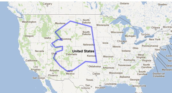
MAPfrappe is a similar tool but with the advantage that you can actually define your own area to compare.
MAPfrappe uses two Google Maps. Click on the top, “Reference” map to draw an outline around the region you wish to compare. As you draw your outline in the top map, it appears at the center of the bottom map. You can drag and zoom the bottom map to anywhere in the world to compare, and the outline stays in the center of the map.
BBC Dimensions
BBC Dimensions (previously on Instant Fundas) is an excellent size comparison tool. Here you can’t define your own region but it has a huge collection of areas for comparison. Aside from countries and capitals, you can select from a wide range of important objects and historical events, environmental disasters, festivals, ancient world monuments, festivals and spectacles and even space objects like the moon. You can map the Apollo 11 moon walk or plot the Mars rovers tracks around your home and neighborhood.
BBC Dimension is based on Google Maps and hence it understands most place names, street names and zip codes that Google maps understands.


0 comments: